Spots and stripes: Roy Lichtenstein’s "ben day dots" techniques and patterns have had the world intrigued since his debut in the mid 1900’s.
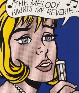
Spots and stripes of cartoonish, bold colors have become a signature staple in pop culture due to Roy Lichtenstein’s consistent applications in his most well-known works. Pop-art is basically synonymous with the Lichtenstein style dots that coat the era. His distinct methods of playful color have created a rare sort of phenomenon since their earliest usage, inspiring a surge of comics and advert-esque imagery in art ever since. Some primary examples of Lichtenstein's "ben day dots" techniques can be seen in his screen prints and woodcuts- such as Modern Art Poster, Reflections on Hair, and Red Lamps.
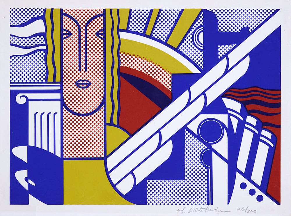
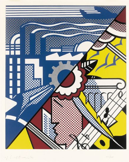
While influenced by the gestural, sweeping marks of comics and advertisements, Roy Lichtenstein ultimately became more familiar and partial to the signature dots in comics [1]. In Modern Art Poster the printed dots and lines of the scene are bold and dramatic, and very kitschy. It is also reminiscent of Art deco curved lines and fine details, blending genres of art to give birth to his own unique art style [2]. Screen printing gave Lichtenstein a medium where he could incorporate the blunt colors and delicate styles he preferred with ease. Here, the dots are uniform, indistinct, almost perforated, while years later on he variegates their size to create shadow effects.
Most famously, Lichtenstein appropriated the Benday dots, the minute mechanical patterning used in commercial engraving, to convey texture and gradations of color—a stylistic language synonymous with his subject matter.
Milton Esterow, “Conversation: How Could You Be Much Luckier Than I Am?”, ARTnews [3]
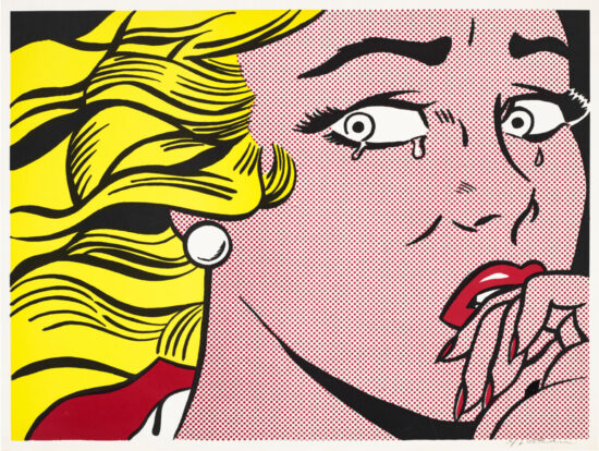
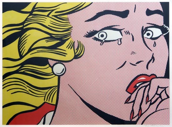
Lichtenstein’s art includes subject matter varying from humanoids to events in time to everyday objects including crying women, lamps, and crashes [4]. The choice of the everyday object is juxtaposed by the bold, synchronic dots used as shading to create interest within the frame. Having comic-strip styling, the simplicity of Lichtenstein’s shapes are repurposed to create all sorts of three-dimensional fantasies. Utilizing bright primary colors to stand out with a white background is a technical color choice leading to his distinctly stylized genre.
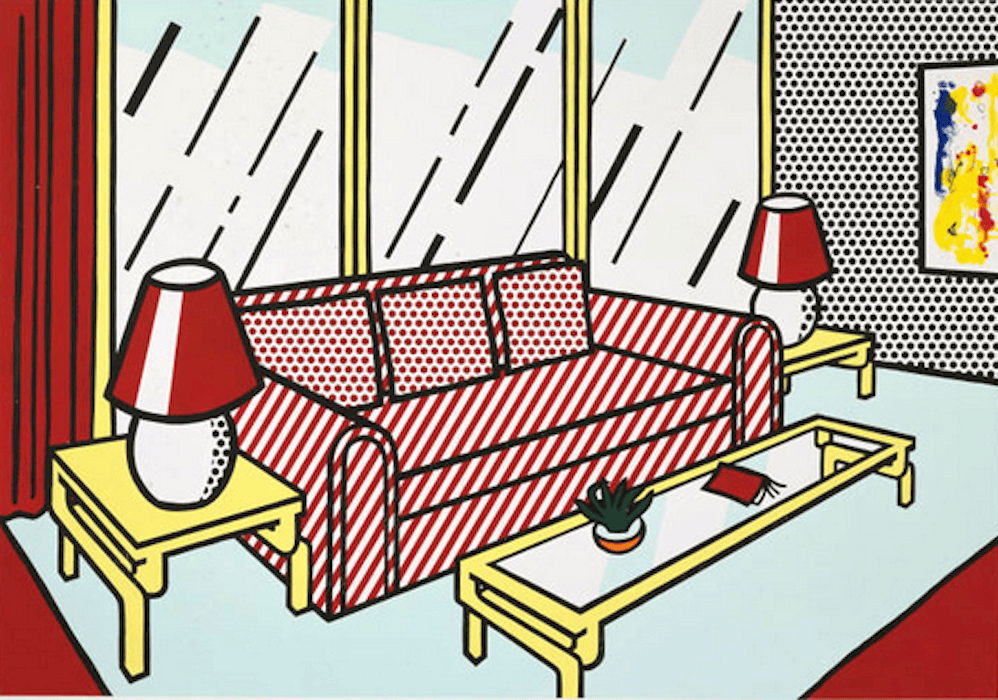
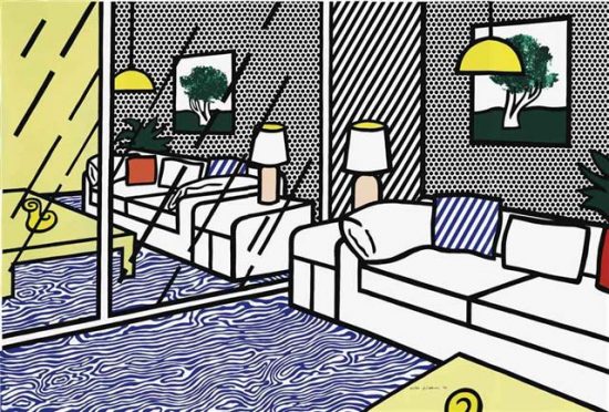
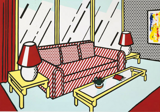
Flat planes of a typical suburban living room are encased in planes of silver, white, and red- all placeholders for windows, curtains, or flooring. The namesakes of the painting, the red lamps, shift the viewer's focus in a diagonal line, creating even more dimension in a realistically flat picture. Using Roy Lichtenstein's dot technique in a new way, he creates shapes in the lamps which contribute to the scene. He created a dot sequence using a wood block stencil technique. Conformity in the dots is seen in every work that he has created, especially shown in his humanoid depictions. Painting every dot in his works would be extremely time consuming- not to mention a headache to make them identical [5].
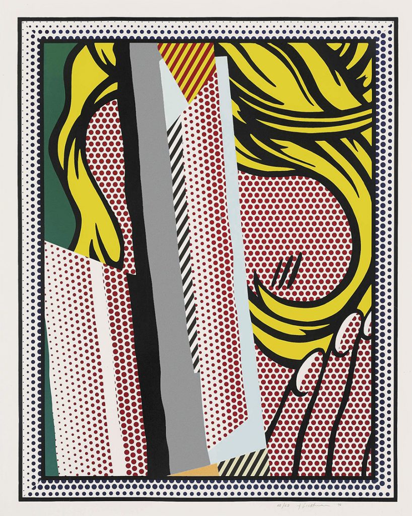
In other works he had visualized his dots as framing and shading in outer edges of the frame, as seen in Reflections on Hair. This piece slightly differs as we see him experiment more within Lichtenstein's own art style. Lichtenstein's dotting technique has grown into a varied form of texture, resulting in the piece becoming much more visually stimulating. While the viewer knows the subject because of the title, he still keeps it a bit mysterious, shrouded in a cloud of gray lines.

The techniques Roy Lichtenstein used in Look Mickey included bold lining as well. In Look Mickey, Lichtenstein uses those same Benday dots technique to mimic their portrayal in print media, namely comics. Black outlining encases the drawing, finalizing the cartoon-like image. He uses block coloring to simplify even further, and uses only the primary color range to do so. [6]
As we have seen, Lichtenstein uses spots, stripes, and prints. He has grasped the art world for decades with his simple and imaginative art style. Pop Art is forever changed by the comic, bright, and busy lines of Roy Lichtenstein.
Citations:
1. Cowart, Jack. “Roy Lichtenstein Foundation.” Roy Lichtenstein Foundation, 2022, https://lichtensteinfoundation.org/.
2. Ibid
3. Milton Esterow, “Conversation: How Could You Be Much Luckier Than I Am?”, ARTnews, Vol. 90, no. 1 (May 1991), p. 91.
4. Cowart, Jack. “Roy Lichtenstein Foundation.” Roy Lichtenstein Foundation, 2022, https://lichtensteinfoundation.org/.
5. Corlett, Mary Lee. The Prints of Roy Lichtenstein: A Catalogue Raisonné 1948-1997. New York: Hudson Hills Press, 2002. Listed and illustrated as catalogue raisonne no. 251.
6. Look Mickey, 1961. https://www.imageduplicator.com/main.php?work_id=0057&year=1961&decade=60#
Browse Masterworks collection of Roy Lichtenstein screen prints for sale.